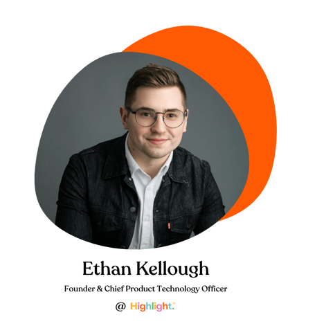
As the driving force behind what is now the Highlight consumer and client experience, Ethan Kellough, Highlight’s CPTO and Founder has been at the forefront of the technological development. With years of product design and development experience under his belt - particularly leveraging consumer empathy - Ethan knew there was a better way to conduct research, build better products, and bring all of these processes into the modern era.

We had the opportunity to dive deeper into Highlight’s technology advancements with Ethan himself and we think he explains it all best - read on to find out the "backend" to this dynamic development story.
What was the motivation behind building this platform?
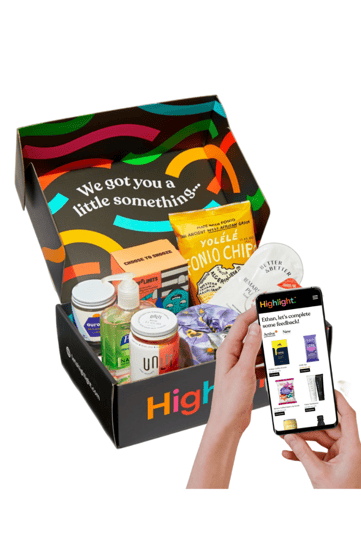
The driving force was realizing that there was not a great way to get products in the hands of consumers when you're doing product testing. The quantitative research space has become a lot more sophisticated as digital data collection and analysis has become more prolific, but when there's a physical product involved, it's really challenging to get good insights.
My background is originally in mechanical engineering and product design. As a product designer, one of the challenges that I always came up against was getting feedback on designs. You can either go one direction, which is really deep user research - get five or six people to use the prototype and try it and get insights - or the other way is going sort of shallow and broad with 300 people: you show them a photo and say, ‘well, what do you think about this’. But there's not really a good middle ground for getting quality, actionable feedback about physical products.
"We built the platform and Highlight around a solution for physical product testing at scale. That was really the impetus for building the whole thing."
How do you believe this technology is changing the market research and product testing game? How do you believe it should be?
 Our vision is a world where there isn't waste in the product development process: there aren’t products getting developed that end up failing or nobody likes them, and there aren't people going to the grocery store and buying something off the shelf and throwing it away because they didn't like it. We know there is a significant amount of waste, both product waste but also human capital waste, in products that are poorly optimized. Our vision for Highlight is to say, how do we solve that problem? How do we make sure that when products are developed in the future, they are made for the right target market, people like them and enjoy them. There are so many different variables in product development and the more that Highlight’s technology can help brands and product builders understand those variables and design for them, the less likely it is that effort of developing a new product goes to waste.
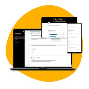
Diving more into how we are doing this on the platform itself - we've definitely tried to streamline the process for both parties and that's part of why we collect information upfront. For consumers, they don't have to constantly go back and fill out screeners and answer the same questions over and over again. And at the same time, they don't get offered products that we don't think will work for them. For brands, we simplify the process by using our technology - something that hasn't been done with physical product testing to date. We've optimized for speed and efficiency and making sure that we're a high quality offering that tries to keep errors to a minimum.
The technology we built is really ready for scalability: it’s a pretty modern tech stack with a strong focus on fault tolerance and scalability. We're using a lot of the same types of technologies that a lot of firms in Silicon Valley are using, which isn't the typical approach in the market research industry. Overall, we've taken a traditional old legacy process and said, okay, how do we put a 2021 spin on this? How do we bring this into the modern era?
From the start, what were the non-negotiable or elements of the app that had to be included?
 One of the most important non-negotiables was data privacy and data security- making sure that everything for both our highlighters and our clients is fully protected and locked down. We’re trusted with personal data about our highlighters, and we're trusted with confidential information about new products from our clients. Making sure that everything there was fully protected was the most important thing.
The other aspect that was a non-negotiable was inclusivity. There are some common practices in market research that we questioned along the way, asking ourselves, does this have to be done this way? How do we make this more inclusive? We're building a community and a consumer brand around giving feedback and we should be inclusive to people who want to give good feedback regardless of any other criteria. We really built the core of the application and the incentive model, and everything around quality feedback. We tried to make it as inclusive as possible for as many people to be a member.
How did you approach ensuring that the consumer and client side apps worked seamlessly together?
What we've focused on is simplicity. Our design principles and our manifesto are around taking a very complex process and trying to make it simple. For all the stakeholders involved, simple and beautiful are the main principles. Product testing is complex and has a lot of variables but we really focused on how we can make a user experience for both the Highlighters and brands that are as simple and seamless as possible. We want them to get the best possible insights and give the best possible feedback so we focused a lot on that aspect of the user experience on both sides.
"Our design principles are centered around simplicity and minimalism, the minimum amount of communication required to keep things as as streamlined as possible."
 We also were making sure that people who are using the application understand what's going on, why things are happening, and the way that they're happening. We wanted to reduce the uncertainty on the user-side. Lastly, the feedback that the Highlighters give and the feedback that the brands receive is really important. We made sure that we have communication around how that feedback is being used to show people the impact they are making.
How have people reacted to the platform?
The reactions have been really positive. There's nothing like this technology in the physical product testing world. The traditional market research processes for physical product testing are really manual, they're really slow, and involve lots of emailing back and forth. Every company that we've talked to has said that this platform is a game changer in their process to make things more efficient. So, all in all, I think the reception has been really positive. We're really looking forward to getting more brands on the platform, getting more products tested, and continuing to sort of tackle this big problem of 90% of products failing. We took extra time upfront to make sure that we had something that was going to work for not just 10 brands or 100 brands, but 1000's or millions of products tested.
.png?width=1200&height=627&name=Highlight%20new%20platform%20for%20GA%20(1).png)
.png?width=1000&height=600&name=Untitled%20design%20(13).png)
![[Image] Highlight team Holiday party 2022](https://www.letshighlight.com/hs-fs/hubfs/%5BImage%5D%20Highlight%20team%20Holiday%20party%202022%20.png?width=1920&height=1080&name=%5BImage%5D%20Highlight%20team%20Holiday%20party%202022%20.png)

